Tuesday 31 December 2013

Construction: Creating a billing block

When creating my billing block I researched Warner Bros Pictures website. I recognised that one of their most recent film posters was of the film 'Gravity', from this I looked further into the credit block to understand what type of features I should be including.


From looking at the 'Gravity' poster I produced my own credit block, stating the following elements shown in the image below. I thought that it was particularly important to use 'produced by', 'screenplay by' 'edited by' and 'music by'. I also followed through with their layout for example the more important information would be larger than others; this would be something like 'screenplay by AMY OLDFIELD'.

I also placed the release date below the credit block, which was the same place of the Gravity poster. They had also placed the logos of institutions here as well as the website address; this is where I also situated mine. At first I separated the Warner Bros Pictures logo from the others, but when I decided to add in the 15 certificate I moved this and placed it alongside the others.

Log: Film poster development

The images I decided to use on my film poster were the ones shown below. I used these three as I felt that they all portray the same narrative and connote similar meanings. All three images use direct mode of address which is something I wanted to use in order to create a relationship with the audience. Each of their facial expression are rather neutral, whereby the audience cannot specifically understand their emotion.


My idea is to place them against a wall, of which the mise-en-scene will connote that they are suspects of a crime, for example behind them I shall place a series of lines and numbers matching the real life mise-en-scene of a police station. In orde
r for this to be effective, I am going to ensure that each image are the same size, by this I mean the initial picture will be cropped so that the same look will be achieved which has been done in the other two.

I am going to place an effect on the image; lighting effects whereby a shadow will be casted upon part of them, and a bright light shone on them upon the top left, this adds to the idea of interrogation, as a spotlight is usually placed on the suspect to pressurise them; this is usually a convention used in film.


Monday 23 December 2013

Construction: Strapline of Magazine

Originally I decided to add a strapline to my magazine front cover, as this was used in all the real media products that I analysed in my research. and I wrote 'BEST THRILLER PREVIEW EVER!' However after looking into my final design more I felt that instead of creating a thriller-genre based magazine I would make it a more widespread magazine, and just change the genre of each edition depending on what the genre of the main article was on. Much like the large magazine corporations such as TotalFilm and Empire.

Therefore as my trailer was mystery thriller based, I acted as though this edition was a one-off due to the hybridised genre. The way the layout changed and the effects added would indicate this. So I then decided to change the phrase within the strapline.


The declarative now states 'WORLD'S BEST PREVIEW TO FILM'.


I have used an incrementum by creating a large mass audience through the noun phrase. By placing my magazine on a global scale it develops the idea that despite all the competition it may face this is still the 'best'. By the use of the superlative 'best' it indicates to the reader that this is a unique magazine and that the reader cannot receive anything better. The latter of the phrase denotes the purpose of the magazine which can easily be interpreted by the readers.

Saturday 21 December 2013

Construction: Barcode on magazine front cover

When developing my magazine front cover, I felt it was the important to place by barcode on the front. Even though that some magazines place their barcode on the back, I felt that it would look more convincing if it was placed here.

However when deciding where to place it, there was very little room, otherwise the magazine would not look aesthetically pleasing. Because of this I changed the initial 'plus' sign. This indicated that there were more articles inside the magazine, but I felt that having puffs on the front cover made it obvious that these were inside as it is a basic convention of this media product and this would already be known by the audience. Therefore I replaced this with the barcode allowing me to achieve what I wanted at this point.

I proposed this idea to my focus group and they agreed that need was no need for the plus sign, so I confirmed my decision of this being replaced by the barcode.

Wednesday 18 December 2013

Construction: Images for ancillary products


The initial screenshot shows images which I flagged in iPhoto, as I thought these were the best out of all the photos taken. The image below shows three close up images, as I was trying to gain a sense of the creation for the poster. I could perhaps use these three images below. These three images below could be placed liked this, as the background is plain and could add effects to make them look like suspects. As they are all wearing black it connotes that they perhaps are not innocent as white would connote this.


Tuesday 17 December 2013

Log: Audience Feedback

The following link shows the audience feedback I have received so far.

https://docs.google.com/spreadsheet/ccc?key=0ArISFvGO2Lm8dDFJSmZraG1YQ0hjUnNqNmt5bWhNSHc&usp=sharing

From this information at the moment it has given me advice as to point I could improve/make stronger...

  1. It was recognised that the dates were different, which I had noticed as I decided that defining a season was a little too brief, so decided to change it to a month; this I then changed on my trailer also. 
  2. It was mentioned that the dialogue was a little loud, this therefore I decreased a little. Someone also suggested that within my trailer instead of having one missed call, I could use a few to emphasis the idea that they are be harassed. I particularly like it and may consider incorporating this if possible.
  3. One suggested that I could perhaps include more institutional information, this I recently changed as at the end of my trailer, I now have a declarative which states the companies which are involved in the production. 
  4. One criticised the poster saying that it does not portray the same narrative. However the trailer that I exported to be shown for the feedback has been developed a lot, so much so that the narrative actually makes sense of that conveyed through the poster. 
  5. I asked for improvements and one suggested that I could use video effects on some shots, they recommended black and white. I did in fact try this however it seemed a little strange in comparison to the rest of the trailer. Therefore when I am explaining the story of the past in the introduction to the trailer I have used the clip effect of 'dream' in order to show a contrast. 
  6. One suggested that I could also use inter-titles, I did consider this myself so I am going to take this advice on board and see whether this works, if it does then I shall include, but a fear that it may be too much.
I am very pleased to know that each of the respondents understood the genre, can strongly see a sense of brand identity and agree that the certificate should be a 15.

Monday 16 December 2013

Log: Audience Feedback

Log: Products so far..

Trailer... new introduction to be added


Film Poster...


Click to play this Smilebox slideshow


Magazine front cover...


With both ancillary products I still need to add the images, and the background. I have displayed some of the images I intend to use. 

CLICK ON IMAGES TO ENLARGE 

Saturday 14 December 2013

Log: Production companies.

When researching trailers many used footage of production companies. I decided that I wanted to use a well-known established one as this would connote to the audience that the film would be of high quality and would be a worth-while watch. Moreover, as my trailer is a horror I wanted this to be perceived through so decided to use this clip below within my trailer as it turns to black, creating a sinister vibe.

Research: Sofia Coppola

Background information..
Sofia Coppola is a contemporary American screenwriter, director and producer of cinematic films. She has received the Academy Award for Best Original Screenplay, and became the third woman to be nominated for an Academy Award for Best Director.

Other films...
Lick the Star (1998)
The Virgin Suicides (1999)
Lost in Translation (2003)
Marie Antoinette (2006)
Somewhere (2010)
The Bling Ring (2013)

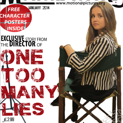
The idea for my front cover of my film magazine is to have a director placed on the front as from my research this was used on the front cover of Fangoria. I have taken numerous amounts of pictures and have used a female model to pose as the director of my film 'One Too Many Lies', therefore as Sofia Coppola is a female director I researched images where Coppola have appeared to gain an idea of what type of shot I should look for, in order to make my own product successful.

Below is a screenshot of the results of 'Sofia Coppola on magazine front cover'. In all her appearances on this type of media she shows little emotion but warmth still remains within the picture, making it aesthetically pleasing and comfortable for the reader to look at. There is no sexual focus in any of the magazines, which enables me to focus on her body language and facial expression in order to portray the image I want.


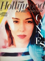
In this image of 'The Hollywood Reporter' magazine, a close up of Sofia Coppola has been used, she is not using direct mode of address yet the gel effect on the front cover draws the attention of the reader. My initial ideas were to position photography equipment and a directory setting in order to connote the role of the female model on the front cover, however I do particularly like this effect as it shows editing has been used; an aspect used very often in filmmaking. The is very little information otherwise which allows the audience to entirely focus on the image, which is something I shall consider.

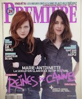
The image of Premiere film magazine, is an example of were Coppola has appeared on the same type of media, for the same type of reason. Here the background is rather plain, with colours used which create a contrast making it appealing and highly eye-catching. Coppola's body language is rather casual with little over expression used  so that the audience can feel comfortable with the director. This has influenced my own ideas further, as I am now consider making my magazine rather plain in order to emphasise the focus.


Tuesday 10 December 2013

Construction: Of film poster so far


This is what I have constructed so far on my film poster.
After researching other film posters, in particular the posters of Warner Bros. Pictures who I am using in the production of my film, I researched the font they used for their billing block. I used this also as I felt that it was a convention of Warner Bros. Pictures. I also tried to create a similar layout and context for example, 'screenplay' and 'in association with'.

I then added in the institutional logos for the companies I had used in the production of the film, as these will be more recognisable to the audience rather than just writing. I separated the Warner Bros. Pictures logo although it was not intentional, it was as I first placed this here, and the Morgan Creek logo on the left which mirrored each other, making it seemed balanced. However I was aware that I had to incorporate the website address on to the film poster, so positioned this next to the Warner Bros. logo as this created the visual balance. The website address I used was the one used for my film magazine, as I have also stated in the credits block that the magazine was in association with the film.


I also added in the date as this is a vital element to the promoting the date of the release so that the audience are aware. I ensured that this was in a larger font to the billing block as this was a more important part for the audience to know.

The name of my film is 'one too many lies' I used the font Plane Crash, as this gave a edgy aesthetic appeal which connotes the genre. This is the largest typography on the page as this is the most important feature which you have to get across to the audience. I have also included a tagline of 'its not over till I say it is', this will feature on the character posters and a line within the trailer. It is positioned at the top of the page, as from my research this was a conventional place where this was positioned.

Left to do...
Insert and image and a background.


Monday 9 December 2013

Planning: Audience of trailer


Identifying the target audience for a product is essential to effectively target your product at them. To ensure I was relating to my audience I decided to research a storyline similar to mine, so that I would know the audience of both of these would be similar/same.
My storyline is particularly relevant to Pretty Little Liars so I researched their target audience...


My target audience...
One Too Many Lies
is Warner Bros Pictures and Morgan Creek latest production. The film entails a tight friendship between teenage girls who are all drawn closely because of the secrets of their past. The teenage film will engage in some of the most common conventions of mystery thriller drama today; bad guys evade the good guys, main protagonists' reckless and sometime illegal behaviour. Some may argue that this can have a dangerous influence upon the watchers however the realistic dynamic draws the attention of varied demographics.


The audience is primarily made up of females between the ages of 16 to 25. This teens/young adult will be able to relate to the protagonists as they are of similar ages. However secondary members of the audience engage also; males between ages of 16 to 25.

Demographics will vary from A/B1, C1 and D. With regards to the
Values, Attitudes and Lifestyle framework my audience would be categorised as strivers as they will be young, fun-loving and trendy, as the film will portray a contemporary ideology. With reference to the Uses and Gratifications theory my audience would be in the category of entertainment, as the purpose of this film is to entertain only, so by watching the film they will be seeking this purpose.


Saturday 7 December 2013

Planning: Audience for magazine

Within my research I was aware that an extra part to the magazine would be a description of an audience members and readership. I have decided to do this also so that I can grasp the concept of ways to attract my audience members.


CLICK TO ENLARGE


Thursday 5 December 2013

Log: Choosing a magazine front cover

One of the main parts to the magazine front cover would be the main images. I took various images and  tried to decide on which one I most preferred, however when I  positioned them in place, none of them seemed to look right. 

First was the picture in the graveyard, however this was a landscape image so could not use this as it cropped out some of the picture. Therefore I may use a shot like this for my film poster, where I could produced a landscape billboard poster. 


I then selected the image of the two friends who have to deal with the consequences, in this image both are using the conventions of direct mode of address and are represent the thriller genre. However, I still do not feel that this is what I am looking for so tried some of the other pictures.


This image shows what the magazine looked like when I tried to use an image of the girl who goes missing. However again, there is something that still does not look how I want it to. So I have decided to reshoot my pictures, in order to get the image I am hoping for. 


I very much dislike all these front cover of the magazines, so I have decided to change my ideas. In my research I analysed a film magazine which showed a director on the front cover of the magazine, so this is something I shall try from now. 

Tuesday 3 December 2013

Construction: Top third of film magazine


The images above shows what has been developed so far on my film magazine. I felt that the top third was an important part  to begin with, as this positioning was conventional place which I have followed through with the ideas I gained within my research.

This will not be the first issue of Motion Pictures, as hopefully this will become a signature font and will eventually act as iconography of the magazine itself. This way by part being covered by 'blood', to represent the genre of the film, the title will still be recognisable to the audience, creating a brand identity for the product.

I also included the website address and date of the edition in this section also, as firstly the web address is placed in a position which then allowed me to visually balance the written content, to fulfil the page as a full heading. As this adds to the aesthetic appeal, it could be consistently used in the same place for each issue, creating a sense on brand identity of the institution. The date enables me to cover the institutional purpose also, the date on the other existing media product I analysed was written in a very small font, so I may consider changing the size when my product begins to progress.


I then added a banner at the very edge of the top third, which stated 'your monthly thriller magazine'. These personal pronoun 'your' establishes a connection with the audience. The 'thriller' magazine identifies the genre of the magazine, however I am still unsure whether to create a mainstream or specialised one.

I asked my focus group for some feedback, and they liked the idea of the banner however was unsure whether to use the phrase that I have done. So I will have to consider other statements.

Monday 2 December 2013

Construction: Magazine Titles

After deciding on the name of my film magazine was: Motion Pictures, I needed a font which would make my magazine distinctive.

Here is an image of three creatively different titles:

As I wanted to turn the name of the magazine into a creative logo/icon I had to ensure that I had a font which would allow me to establish this. The font I used is called 'wrestlemania' which I found to be very effective due to the bold and emphasis on the noun 'motion' which has connotations of cinema, film etc so I liked how this was displayed.

My next decision was whether to have the words separated or joined together. I immediately preferred the phrase joined as one, as I felt this acted as a brand more than when the two words were separated. I made the fact that it was two words by enlarging the 'P' to make 'Pictures' more recognisable.
I then played around with effects and had to choose out of these three favourites.

Using my own opinion and that of my focus group, I have decided to use the third option. As it was voted that the first was too bolded which made it look a little comic-like and cartoon which would portray the film as imaginable and unrealistic. We also thought this on the second but the opposite way, that the line was too thin and did not seem to really work as a masthead as it did not strike the audience. 

We thought that the third title worked the best as it received the portrayal that was wanted. Particularly as this was the favourite of the focus group I intend to use this, as I know that this is aesthetically pleasing to them.

Log: Improvements to current work

In todays lesson we looked at a powerpoint where we were shown previous examiners reports, which gave us an insight as to what we need to do to improve our current work. This was very helpful as it has allowed me to identify areas which could be developed.

Click here to view the powerpoint slideshow we were shown.

From looking at this, there are particular areas where I have recognised that I could improve.

  1. Link back continuously to my focus group to show feedback which I can then use to improve.
  2. Ensure I make use of animatics/storyboards to establish original ideas.
  3. Make use of screengrabs and logbooks to show how my production and ideas are developing.
  4. Make connections between my research, planning and construction work, for example explain why I analysed something and how it has influenced my own ideas and product.

Tuesday 26 November 2013

Research: Horror magazines

Through researching the Internet and trying to find magazine front covers to analyse, it is clear that the horror genre is not often displayed. Perhaps this is due to the age restrictions and graphic images so cannot be shown on the front cover where it can be seen by people under the age rating of the film, particularly if it was for sale in an ordinary shop. Because of this I have tried very hard to find a horror based magazine which I could analyse in order to find out what the conventions are. 

This is what I found in my research...


This is an example of a type of horror magazine- 'Shivers'. 

Friday 22 November 2013

Planning: Reading a trailer

There are several questions I shall ask myself once my film trailer is complete. This will cover the topics of formal properties, content, sound, marketing, exhibition etc.

From reading this article it has given me a clearer idea at what I should be looking for.
  1. Is the storyline too exposed?
  2. What are the shot lengths? too quick/ too slow.
  3. What transitions are used? Any clear skills shown?
  4. How is the explanation provided? taglines/voice-over? Transcribe.
  5. What is the diegetic appeal? eg.genre, storyline
  6. How am I going to market the film? Social media, advertisement
  7. Has music helped to structure the trailer?
  8. What is the meaning behind the trailer?
  9. What is the tone/attitude of the trailer?
  10. Ensure audience will have an appeal.

Research: Purpose of a trailer

The purpose of a film trailer is to entice fanatics to see the particular film which is being promoted.


What I have learnt from this article.
  1. Editing has to show enough to intrigue the viewer, yet not too much which could potentially ruin the plot. The editing must strike the balance. 
  2. Ensure that the tone and genre can be clearly identified so that the audience knows whether or not they want to view the film. 
  3. Music is the most reliable way to make the audience feel they way us producers want to, so that they will want to see the film.
  4. Taglines are becoming a more popular convention recently, more so than voice-over. 
  5. Voiceover provides an explanation for quick shots shown in the trailer.
  6. Trailer represent film artistry at the highest level. 

Wednesday 20 November 2013

Research: Cinematic horror

Click here to view the article on the gendered aesthetics of cinematic horror.

What I have learnt...
  1. Referring to a feminine aesthetic of horror is a reflection of specific interest in the female horror film audience. 
  2. The emotions of the female adds to the aesthetic appeal of the horror.
  3. Women like horror films just as much as men because of this, but there are some aspects which they prefer eg. special effects, make up.
  4. Two types of viewers; specialist and average. Special viewers are more interested in graphic horror, whereas the average viewers who find their curiosity in less-explicit horror but in genres such as fantasy.
  5. Women preferences include the stronger representations of femininity for example developments in characters of a female herom as well as attractive, rich, atmospheric, fantastical mise-en-scene and cinematography.
  6. Female audience least preference is gory/graphic images.
  7. They tend to make negotiated readings with regards to the reception theory- Stuart Hall.
  8. Womens preferences are contradictory to stereotypes; because of the perceived masculine nature of the genre and discourse surround the hegemonic and idealised models of femininity.
  9. High levels of suspense enjoyed by both genders, particularly females.
  10. Gothic mise-en-scene should be repeatedly throughout, as a favourite scenic image.

Research: Analysis of Empire Magazine front cover


Saturday 9 November 2013

Construction: Change of layout

When I had placed the main elements on to my magazine front cover I still felt a little dissatisfied so I decided to change my idea and instead use the 'director' of the film as the model of the front cover, as this was something I found within my research.

After taking several images and selecting the ones I liked most on my front cover, it looked a little too much when it was surrounded by text. This led me to change the layout. For this I decided to place the image at one side of the magazine, and have the text on the other. This looked a lot better, and I am now much more pleased with the way it looks.

I then needed to choose a background image. I decided that in order for readers to understand the purpose more I would use mise-en-scene of a directing studio so would use props of media equipment; cameras, lighting etc to portray this.


Wednesday 6 November 2013

Planning: Choice of ancillary products

A promotion package for a new film, to include a 2 minute trailer, together with two of the following three options:
a website homepage for the film;
a film magazine front cover, featuring the film;
a poster for the film.


I feel that the best choice to promote my mystery thriller film would most definitely be the film magazine front cover, as this relates to Uses&Gratifications audience theory, as through this the audience can fulfil their needs of diversion, personal relationships&identity and surveillance. 


However I am unsure whether to do a poster or a website homepage as the poster my be similar to the front cover, whereas the webpage would show more skills, but not necessarily skills that I expertise in. 


Choice: Film magazine front cover & poster.

Monday 4 November 2013

Planning: Social media conversation gist


Planning: Ideas to consider


  • Establishing shots
  • Plot twists
  • Flashbacks shown through cross-cutting
  • More fast-paced shots

Planning: Development

My initial idea was that I was just going to base the trailer on the thriller genre, however my focus group suggested that I should create a contrast so that the audience are aware of the friendship and solidarity of the group of three before the drama took place. The contrast will contain short 0.6 clips of the girls at different angles, in different circumstances so that the audience can connote the relationship they had. As it is basically a flashback of the past, I hope to edit it in a way to make this obvious, for example; change the colour effect. 

The shot below 'you can't keep your secrets from me!' was what I was firstly going to use as a note from the anonymous figure. I have decided to change this to 'I know your secret!' as this is easier to read, as it is not as long. This adds to the fast pace of the clips, and makes it easy especially as the clip will only be shown for 1 second.