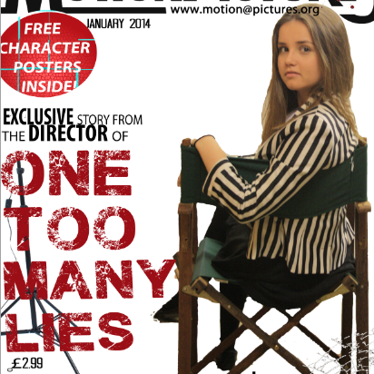
 When I had placed the main elements on to my magazine front cover I still felt a little dissatisfied so I decided to change my idea and instead use the 'director' of the film as the model of the front cover, as this was something I found within my research.
 After taking several images and selecting the ones I liked most on my front cover, it looked a little too much when it was surrounded by text. This led me to change the layout. For this I decided to place the image at one side of the magazine, and have the text on the other. This looked a lot better, and I am now much more pleased with the way it looks.
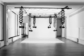
I then needed to choose a background image. I decided that in order for readers to understand the purpose more I would use mise-en-scene of a directing studio so would use props of media equipment; cameras, lighting etc to portray this.

No comments:
Post a Comment