
Thursday, 28 November 2013
Wednesday, 27 November 2013
Tuesday, 26 November 2013
Research: Horror magazines
Through researching the Internet and trying to find magazine front covers to analyse, it is clear that the horror genre is not often displayed. Perhaps this is due to the age restrictions and graphic images so cannot be shown on the front cover where it can be seen by people under the age rating of the film, particularly if it was for sale in an ordinary shop. Because of this I have tried very hard to find a horror based magazine which I could analyse in order to find out what the conventions are.
This is what I found in my research...

This is an example of a type of horror magazine- 'Shivers'.

Monday, 25 November 2013
Friday, 22 November 2013
Planning: Reading a trailer
There are several questions I shall ask myself once my film trailer is complete. This will cover the topics of formal properties, content, sound, marketing, exhibition etc.
From reading this article it has given me a clearer idea at what I should be looking for.
From reading this article it has given me a clearer idea at what I should be looking for.
- Is the storyline too exposed?
- What are the shot lengths? too quick/ too slow.
- What transitions are used? Any clear skills shown?
- How is the explanation provided? taglines/voice-over? Transcribe.
- What is the diegetic appeal? eg.genre, storyline
- How am I going to market the film? Social media, advertisement
- Has music helped to structure the trailer?
- What is the meaning behind the trailer?
- What is the tone/attitude of the trailer?
- Ensure audience will have an appeal.
Research: Purpose of a trailer
The purpose of a film trailer is to entice fanatics to see the particular film which is being promoted.
What I have learnt from this article.
- Editing has to show enough to intrigue the viewer, yet not too much which could potentially ruin the plot. The editing must strike the balance.
- Ensure that the tone and genre can be clearly identified so that the audience knows whether or not they want to view the film.
- Music is the most reliable way to make the audience feel they way us producers want to, so that they will want to see the film.
- Taglines are becoming a more popular convention recently, more so than voice-over.
- Voiceover provides an explanation for quick shots shown in the trailer.
- Trailer represent film artistry at the highest level.
Wednesday, 20 November 2013
Research: Cinematic horror
Click here to view the article on the gendered aesthetics of cinematic horror.
What I have learnt...
What I have learnt...
- Referring to a feminine aesthetic of horror is a reflection of specific interest in the female horror film audience.
- The emotions of the female adds to the aesthetic appeal of the horror.
- Women like horror films just as much as men because of this, but there are some aspects which they prefer eg. special effects, make up.
- Two types of viewers; specialist and average. Special viewers are more interested in graphic horror, whereas the average viewers who find their curiosity in less-explicit horror but in genres such as fantasy.
- Women preferences include the stronger representations of femininity for example developments in characters of a female herom as well as attractive, rich, atmospheric, fantastical mise-en-scene and cinematography.
- Female audience least preference is gory/graphic images.
- They tend to make negotiated readings with regards to the reception theory- Stuart Hall.
- Womens preferences are contradictory to stereotypes; because of the perceived masculine nature of the genre and discourse surround the hegemonic and idealised models of femininity.
- High levels of suspense enjoyed by both genders, particularly females.
- Gothic mise-en-scene should be repeatedly throughout, as a favourite scenic image.
Monday, 18 November 2013
Thursday, 14 November 2013

Monday, 11 November 2013
Saturday, 9 November 2013
Construction: Change of layout
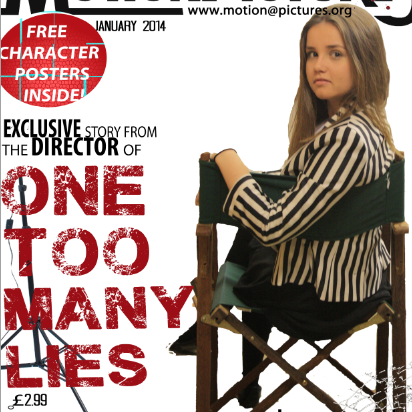 When I had placed the main elements on to my magazine front cover I still felt a little dissatisfied so I decided to change my idea and instead use the 'director' of the film as the model of the front cover, as this was something I found within my research.
 After taking several images and selecting the ones I liked most on my front cover, it looked a little too much when it was surrounded by text. This led me to change the layout. For this I decided to place the image at one side of the magazine, and have the text on the other. This looked a lot better, and I am now much more pleased with the way it looks.
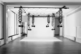
I then needed to choose a background image. I decided that in order for readers to understand the purpose more I would use mise-en-scene of a directing studio so would use props of media equipment; cameras, lighting etc to portray this.

Thursday, 7 November 2013


Wednesday, 6 November 2013
Planning: Choice of ancillary products
A promotion package for a new film, to include a 2 minute trailer, together with two of the following three options:
a website homepage for the film;
a film magazine front cover, featuring the film;
a poster for the film.
I feel that the best choice to promote my mystery thriller film would most definitely be the film magazine front cover, as this relates to Uses&Gratifications audience theory, as through this the audience can fulfil their needs of diversion, personal relationships&identity and surveillance.
However I am unsure whether to do a poster or a website homepage as the poster my be similar to the front cover, whereas the webpage would show more skills, but not necessarily skills that I expertise in.
Choice: Film magazine front cover & poster.
Monday, 4 November 2013

Planning: Ideas to consider
- Establishing shots
- Plot twists
- Flashbacks shown through cross-cutting
- More fast-paced shots
Planning: Development
My initial idea was that I was just going to base the trailer on the thriller genre, however my focus group suggested that I should create a contrast so that the audience are aware of the friendship and solidarity of the group of three before the drama took place. The contrast will contain short 0.6 clips of the girls at different angles, in different circumstances so that the audience can connote the relationship they had. As it is basically a flashback of the past, I hope to edit it in a way to make this obvious, for example; change the colour effect.

The shot below 'you can't keep your secrets from me!' was what I was firstly going to use as a note from the anonymous figure. I have decided to change this to 'I know your secret!' as this is easier to read, as it is not as long. This adds to the fast pace of the clips, and makes it easy especially as the clip will only be shown for 1 second.


Subscribe to:
Posts (Atom)