Sofia Coppola is a contemporary American screenwriter, director and producer of cinematic films. She has received the Academy Award for Best Original Screenplay, and became the third woman to be nominated for an Academy Award for Best Director.
Other films...
Lick the Star (1998)
The Virgin Suicides (1999)
Lost in Translation (2003)
Marie Antoinette (2006)
Somewhere (2010)
The Bling Ring (2013)
The idea for my front cover of my film magazine is to have a director placed on the front as from my research this was used on the front cover of Fangoria. I have taken numerous amounts of pictures and have used a female model to pose as the director of my film 'One Too Many Lies', therefore as Sofia Coppola is a female director I researched images where Coppola have appeared to gain an idea of what type of shot I should look for, in order to make my own product successful.
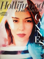
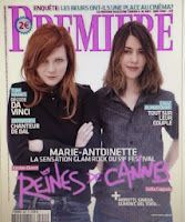
Below is a screenshot of the results of 'Sofia Coppola on magazine front cover'. In all her appearances on this type of media she shows little emotion but warmth still remains within the picture, making it aesthetically pleasing and comfortable for the reader to look at. There is no sexual focus in any of the magazines, which enables me to focus on her body language and facial expression in order to portray the image I want.

In this image of 'The Hollywood Reporter' magazine, a close up of Sofia Coppola has been used, she is not using direct mode of address yet the gel effect on the front cover draws the attention of the reader. My initial ideas were to position photography equipment and a directory setting in order to connote the role of the female model on the front cover, however I do particularly like this effect as it shows editing has been used; an aspect used very often in filmmaking. The is very little information otherwise which allows the audience to entirely focus on the image, which is something I shall consider.

The image of Premiere film magazine, is an example of were Coppola has appeared on the same type of media, for the same type of reason. Here the background is rather plain, with colours used which create a contrast making it appealing and highly eye-catching. Coppola's body language is rather casual with little over expression used so that the audience can feel comfortable with the director. This has influenced my own ideas further, as I am now consider making my magazine rather plain in order to emphasise the focus.

No comments:
Post a Comment