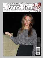
One of the main parts to the magazine front cover would be the main images. I took various images and tried to decide on which one I most preferred, however when I positioned them in place, none of them seemed to look right.
First was the picture in the graveyard, however this was a landscape image so could not use this as it cropped out some of the picture. Therefore I may use a shot like this for my film poster, where I could produced a landscape billboard poster.

I then selected the image of the two friends who have to deal with the consequences, in this image both are using the conventions of direct mode of address and are represent the thriller genre. However, I still do not feel that this is what I am looking for so tried some of the other pictures.

This image shows what the magazine looked like when I tried to use an image of the girl who goes missing. However again, there is something that still does not look how I want it to. So I have decided to reshoot my pictures, in order to get the image I am hoping for.
I very much dislike all these front cover of the magazines, so I have decided to change my ideas. In my research I analysed a film magazine which showed a director on the front cover of the magazine, so this is something I shall try from now.

No comments:
Post a Comment